Content Fusion Browser Interface
The Oxygen Content Fusion browser interface can be accessed by using a task link and then logging in. Reviewers usually receive the link via some sort of messaging app, while task creators can access the interface by clicking on the task name in the Tasks Manager view (within Oxygen XML Editor/Author) or from your organization's Content Fusion browser login page.
The Oxygen Content Fusion browser interface includes a top stripe that is always visible and it contains a user drop-down menu and other actions depending on the page that is opened within the interface. A left navigation stripe is also always visible and it contains buttons for navigating to various pages within the interface. The main area (below the top stripe and to the right of the left navigation stripe) displays the current page within the interface and is where most activities occur.
Top Stripe

The stripe at the top of the interface includes the following options and components:
 Oxygen
Content Fusion Logo
Oxygen
Content Fusion Logo- Clicking on the
 Oxygen Content Fusion logo on the left side of
the top stripe opens the My
Review Tasks page that lists all the tasks that are assigned to
you and tasks that you created (or own).
 - Projects
- Opens the Projects page that displays a list of all the projects.
- My Review Tasks
-
Opens the My Review Tasks page that displays a list of all the current tasks that you own or that were assigned to you.
- User Name Menu
-
Your user name is displayed at the right side of the top stripe. If you click on your name, you have access to the following options:
- Profile
- Opens a profile settings page that displays your name, email, avatar, and allows you to delete your account or specify which types of notifications will be sent to you via email.
- Log Out
- Logs out of the Oxygen Content Fusion interface.
When a page within a review task or project is open, additional actions become available below the top stripe, depending on the page and the user role. For example, if a task owner opens a page within a task that they have created, the actions displayed in the following image will appear:

The Close review button allows a task owner to close a review task to give them time to address feedback, while the Share button opens a dialog box with options for sharing the task.
Left Stripe
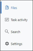
When a page within a review task or project is open, a navigation stripe on the left side of the interface appears and provides buttons for opening various Content Fusion pages.
The main differences between working with non-project based review tasks and projects are:
- Review Tasks - Provides tools for technical writers and reviewers to create and use review tasks for efficient collaboration during their documentation review process.
- Projects - Provides additional tools for technical writers to help manage a DITA project hosted in a Git repository while maintaining full compatibility with existing tools and workflows. Review tasks created within a Content Fusion project offer additional functionality, such as the ability to merge changes using a built-in file comparison/merge tool and to build WebHelp or PDF output deliverables.
After you navigate to a page within a review task or an existing project, the buttons on the left stripe may change to reveal more navigation buttons, depending on the page and the user role. For example, the following image shows the buttons that are available for a Reviewer when a page within a task is open.

Main Area
The main area (below the top horizontal stripe and to the right of the left stripe) displays the current page and is where most of your activity takes place. Various actions and possibilities become available depending on the page and user role.
When a page within a review task or project is open, a breadcrumb is displayed at the top of the main area that can be used to navigate to previous pages.

