JSON Schema Palette View (Available in Design Mode)
The Palette view is designed to offer quick access to JSON schema components and to improve the usability of the JSON schema diagram builder. You can use the Palette to drag and drop components into the Design mode. If the view is not displayed, it can be opened by selecting it from the menu.


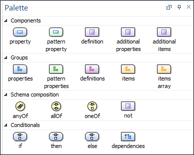
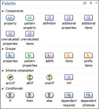
Components are organized functionally into 4 collapsible categories:
- Components: property, patternProperty, definition, additionalProperties, additionalItems, unevaluatedProperties (for 2019-09 or 2020-12 schemas), unevaluatedItems (for 2019-09 or 2020-12 schemas).
- Groups:
properties, patternProperties, definitions/$defs (for draft
2019-09 or 2020-12 schemas), items, itemsArray, prefixItems
(for 2019-09 or 2020-12 schemas).Note:Two of the group palette components presented above (itemsArray and patternProperty), have no match in JSON schema keywords. They were introduced only as a design convenience and their use does not generate code that would affect the validity of the edited schema.
- Schema composition: anyOf, allOf, oneOf, not.
- Conditionals: if, then, else, dependencies (for draft-04, draft-06, or draft-07 schemas), dependentRequired (for 2019-09 or 2020-12 schemas), dependentSchemas (for 2019-09 or 2020-12 schemas).
- Click and hold a graphic symbol from the Palette view, then drag the component into the Design view.
- A line dynamically connects the component with the XML schema structure.
- Release the component into a valid position. Note:You cannot drop a component into an invalid position. When you hover the component into an invalid position, the mouse cursor changes its shape into
 . Also, the connector line changes its
color from the usual dark gray to the color defined in the Validation error highlight color option
(default color is red).
Tip:
When dragging and dropping a property/definition
or pattern property on a component, if it does not have the corresponding group component
(properties, definitions, patternProperties), it will automatically
be created.
Resources
For more information about the Schema palette, watch our video demonstration:
