Tables
This section is of special interest if you are creating a CSS stylesheet for a custom XML
document. For HTML, Oxygen PDF Chemistry already defines the needed selectors for the
<table> element.
This is an example of a very simple table in an XML document:
<tbl>
    <caption>A table.</caption>
    <rw>
        <c rspan="2"> Spans vertically </c>
        <c> Other cell </c>
        <c> Other cell </c>
    </rw>
    <rw>
        <c cspan="2"> Other cell, spanning to the right </c>
    </rw>
</tbl>
Defining Rows and Cells
First, mark the <tbl> element as being a table:
tbl {
    display: table;
}
Next, the rows and cells:
rw {
    display: table-row;
}
c {
    display: table-cell;
}
Defining the Column and Row Span
The processor needs to know how the cells span multiple rows or columns. For this, there are
two properties available: table-column-span and
table-row-span.
c[cspan] {
    table-column-span: attr(cspan, integer);
}
c[rspan] {
    table-row-span: attr(rspan, integer);
}
Defining the Table Caption
You can define table captions by using the display:table-caption. To change
the position of the caption relative to the table grid, you need to use the
caption-side property:
caption {
    display:table-caption;
    caption-side:bottom;
}
Repeating Headers and Footers
Any element marked with either the table-header-group or
table-footer-group property is automatically repeated when a table is
split over a sequence of pages. It is required that they contain only elements with the
display property set to table-row.
<tbl>
    <head>
        <rw>
            <c> Name</c>
            <c> Value </c>
        </rw>
    </head>
    <body>
        <rw> ... </rw>
        <rw> ... </rw>
    </body>
</tbl>
The CSS:
head {
    display: table-header-group;
}
rw {
    display: table-row;
}
Repeating Captions
By default, the captions are not repeated on all pages a table spans. To enable this, you
should mark the elements with a table caption display as with the
-oxy-caption-repeat-on-next-pages property:
caption {
    -oxy-caption-repeat-on-next-pages: yes;
}
The allowed values are yes or no and it is inheritable.
If you want to indicate that the page is a continuation, you can associate a static text to
the caption that appears only on subsequent pages. For example, you can use an
:after element as in the following example:
caption:after(2) {
    display:inline;
    content: "(continued)";
    -oxy-show-only-when-caption-repeated-on-next-pages: yes;
}
This example uses an :after element with the value of 2 to avoid
conflicts with normal :after static elements that you may already use in
your CSS.
Column Width and Styles
Oxygen PDF Chemistry supports an automatic layout for tables. This means the allocation of column width is done automatically based on the content size. In the following example, the HTML table has an automatic layout (this is also the default):
table {
    table-layout:auto;
}table {
table-layout:auto;
width: 100%;
hyphens:auto;
}To switch to a fixed layout:
table {
    table-layout:fixed;
}
If you use the fixed layout and you are not satisfied with equal column widths, for HTML, you
should use the @style attribute on the <col>
element:
 <table style="width:2in;">
        <colgroup>
              <col style="width: 40%; background-color:cyan"/>
              <col style="width: 60%"/>
        </colgroup>
...
For arbitrary XML, you should use the table-column value in a
display property for the element that represents the column. Suppose you
have the following XML:
 <tbl>
        <colgr>
              <column wd="30%"/>
              <column wd="70%"/>
        </colgr>
...
The following CSS links the @wd attribute to the width property and defines
a different background for the first column.
tbl {
    disply:table;
}
colgr {
    display: table-column-group;
}
column {
    display: table-column;
    width: attr(wd);
}
column:first-of-type {
    background-color: yellow;
}
Proportional column widths (such as the ones used in the CALS tables from DITA or DocBook) are
supported, but only when they are set in a @width attribute on the
<column> element (the one with the display
property set to table-column):
...
<column width="3*"/>
<column width="7*"/>
...
Rotating Tables
There are cases where you have large tables and you need to rotate them to make them fit on your page. For instance, the default page orientation is portrait, but if you have a wide table with lots of columns, it might bleed to the right of the page.
- Associate a wider page (i.e. landscape) to the table that needs more space. The
disadvantage is that the table will force a page break before and after
it.
@page landscape-page-for-large-tables { size: A4 landscape; } tbl { display: table; page: landscape-page-for-large-tables; } - Rotate the table using the
transformCSS property. The table will not create page breaks, but is susceptible to bleeding if its height exceeds the page width.tbl { display: table; width: 200pt; transform: rotate(90deg); }Note: The table needs to havetable-layout: fixedand awidth.
The page is now landscape and you probably also need to change the headers and footers to
match this new orientation. One way of doing this is to move the header content from the
@top-left, @top-center, and @top-right
rules into page margin boxes from the right, and apply a transform property
on them.
@page :left {
  @top-left {
     content: string(maptitle) string(parttitle) string(chaptertitle) " | " counter(page);
     font-size:8pt;
  }
  @bottom-left {
      /**/
  }
  @bottom-right {
      /**/
  }
}

@page :right{
  @top-right {
     content: string(maptitle) string(parttitle) string(chaptertitle) " | " counter(page);
     font-size:8pt;
  }
  @bottom-right {
      /**/
  }
  @bottom-left {
      /**/
  }
}right-bottom or
right-top, depending on the page
position: /*
* Table orientation.
*/
@page table-landscape:right {
size:landscape;
@top-left{
content:none;
}
@top-center{
content:none;
}
@top-right{
content:none;
}
@right-bottom{
content: string(chaptertitle) " | " counter(page);
font-size:8pt;
transform:rotate(90);
vertical-align: middle;
text-align: right;
}
}
@page table-landscape:left {
size:landscape;
@top-left{
content:none;
}
@top-center{
content:none;
}
@top-right{
content:none;
}
@right-top{
content: string(maptitle) string(parttitle) string(chaptertitle) " | " counter(page);
font-size:8pt;
transform:rotate(90);
vertical-align: middle;
text-align: left;
}
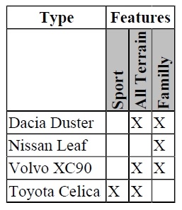
}Rotating Cell Content
transform CSS property.
Remember that only the content of the cell is rotated, not the cell itself. The rotation
angle is clockwise. In the following example, the cells marked with the class
rotate on their side are
rotated:.rotate {
transform:rotate(270deg);
font-style: bold;
text-align: left;
vertical-align: bottom;
white-space: pre;
background-color: silver;
}<html xmlns="http://www.w3.org/1999/xhtml">
<table>
<tr>
<th>
Type
</th>
<th colspan="3">Features</th>
</tr>
<tr>
<th></th>
<th class="rotate">Sport</th>
<th class="rotate">All Terrain</th>
<th class="rotate">Family</th>
</tr>
........